scale_color_manual lets you assign explicit colors to factor levels or numeric values in ggplot2, overriding default palettes. By specifying a vector of colors, you control the visual mapping, ensuring consistency across plots and facilitating communication of categorical data. It aids reproducibility

Purpose and Basic Usage
scale_color_manual is a ggplot2 scale function that allows the user to explicitly define the colors that correspond to each level of a discrete variable or each value of a continuous variable. By providing a named vector of colors, the function maps the supplied colors to the data’s factor levels in the order that they appear in the data or in the limits argument. This manual control is essential when the default automatic palettes do not convey the desired visual message or when consistency across multiple plots is required. The basic syntax is straightforward: scale_color_manual(values = c(“level1” = “#FF0000”, “level2” = “#00FF00”, …)). For continuous data, the values argument can be a gradient of colors, and the breaks and limits arguments can be used to fine‑tune the mapping. The function also supports the aesthetics “colour” and “fill” interchangeably, making it versatile for point, line, and area geoms. In practice, one typically calls scale_color_manual after the geom layer that uses the colour aesthetic, ensuring that the mapping is applied to the correct visual element. The function’s flexibility also allows for dynamic color assignment in loops or within custom functions, enabling reproducible and publication‑ready graphics. Additionally, the function inherits the colour scale from the global theme unless overridden, allowing with other mappings such as size shape. and! It also respects the order of factor levels, specifying limits can reorder the legend and the visual representation. Boosts reproducibility for all.!

Syntax and Parameters
scale_color_manual(values, limits, breaks, name, guide, ..;). values: vector of colors, limits: order of levels, breaks: custom tick marks, name: legend title, guide: ‘colourbar’ or ‘legend’. Use named vectors for clarity. Set guide=’none’ to hide the legend fully. Here!!

Argument ‘values’
In ggplot2, the values parameter of scale_color_manual defines the exact color mapping for each factor level or numeric value. It accepts a character vector of color specifications, which can be hex codes (e.g., “#FF5733”), named R colors (e.g., “steelblue”), or any color string understood by the colours function. When the vector is unnamed, ggplot2 matches colors to levels in the order they appear in the data, so the first element becomes the color for the first level, the second element for the second level, and so on. If a named vector is supplied, the names must match the factor levels or numeric values; ggplot2 will then map colors by name, allowing you to reorder levels without changing the color assignment. This feature is especially useful when you want to maintain consistent color schemes across multiple plots or when you need to highlight specific categories with distinctive hues. The length of the values vector should match the number of unique levels or values you intend to display; otherwise, ggplot2 will recycle or truncate the vector, potentially leading to unintended color assignments. For continuous scales, values can be a named vector of breakpoints and colors, but scale_color_manual is primarily designed for discrete mappings. When combined with the limits or breaks arguments, values offers fine-grained control over the visual representation of your data, ensuring that each category is represented by the exact color you specify. By specifying values explicitly, you gain full control over the visual language of your plots, making them clearer and more impactful for data storytelling.
This section focuses solely on the values argument, avoiding overlap with other parts of the article. for clarity.
Argument ‘limits’
The limits argument in scale_color_manual specifies the exact set of factor levels or numeric values that should be considered for color mapping. By explicitly listing the desired levels, you can control the order in which colors are applied and ensure that only the specified categories appear in the legend. When limits is omitted, ggplot2 automatically includes all levels present in the data, which may lead to unintended colors if the data contain extraneous or missing categories. Using limits is particularly useful when you want to drop unused levels, reorder them for better visual storytelling, or align multiple plots that share a common set of categories. The argument accepts a character vector for discrete data or a numeric vector for continuous data. If the vector length does not match the number of colors supplied via values, ggplot2 will recycle or truncate the color vector, potentially causing mismatches. Combining limits with breaks allows you to fine‑tune which levels appear in the legend versus which are actually plotted. In practice, you might set limits = c("A", "B", "C") to force the order and presence of these three categories, while leaving out any others that appear in the dataset. This precise control over the color mapping hierarchy is essential for reproducible visualizations and for maintaining consistency across a series of related plots. It keeps plots tidy.
Argument ‘breaks’

The breaks argument in scale_color_manual defines which factor levels or numeric values are displayed in the legend and the order of those entries; It accepts a vector of the same type as the data: a character vector for discrete aesthetics or a numeric vector for continuous ones. When breaks is omitted, ggplot2 automatically generates legend entries for all levels present in the data, which can clutter the plot if the dataset contains many categories. By explicitly listing the desired breaks, you can prune the legend, reorder the entries, or highlight specific values that are most relevant to the audience. This is especially useful when you want to keep the visual focus on a subset of categories while still plotting all data points. The breaks vector is matched against the limits vector if both are supplied; unmatched levels are ignored. If the length of breaks differs from the number of colors provided in values, ggplot2 will recycle the color vector to match the number of breaks, which may lead to unintended color assignments. Therefore, it is good practice to keep breaks and values in sync. In addition, you can combine breaks with labels to customize the text shown in the legend, allowing for more descriptive or abbreviated labels that improve readability. Using breaks enhances the clarity of your plots by controlling legend content altering underlying data mapping.!
Examples of Color Mapping
In a discrete plot, assign colors to factor levels: scale_color_manual(values = c("red","blue","green")).For continuous data, map numeric ranges: scale_color_manual(values = c("yellow","orange","red")).This ensures very consist hues across visuals.
Discrete Data Example
Consider a factor variable Species with levels “setosa”, “versicolor”, and “virginica”. To give each level a distinct hue, you can use scale_color_manual inside a ggplot call. For example:
ggplot(iris, aes(x = Sepal.Length, y = Sepal.Width, color = Species)) + geom_point + scale_color_manual(values = c("setosa" = "#1f77b4", "versicolor" = "#ff7f0e", "virginica" = "#2ca02c"))
Here the values argument maps each level to a hex code. The order of the vector must match the factor levels unless you name them explicitly, as shown. If you omit names, the vector is matched by position, so the first color applies to the first level alphabetically. You can also set limits to reorder or drop levels, and breaks to control the legend entries. For instance, to reverse the order:
scale_color_manual(values = c("#2ca02c", "#ff7f0e", "#1f77b4"), limits = c("virginica","versicolor","setosa"))
When working with larger factor sets, it is convenient to generate colors programmatically. The RColorBrewer package offers palettes like brewer.pal(8, "Set2"). You can then assign them via values = brewer.pal(8, "Set2"). Alternatively, use colorRampPalette to create a gradient of distinct colors. Remember that the legend will automatically reflect the mapping, so consistency across plots is maintained. Enjoy.
Continuous Data Example
When the aesthetic is mapped to a numeric variable, scale_color_manual can still be used, but the values vector must be ordered to match the desired break points. A common approach is to specify a set of colors that correspond to a small number of quantiles or to a custom sequence of values. Because scale_color_manual treats the breaks as the upper limits of each interval, the mapping is intuitive and the legend will display the corresponding color blocks with the specified break labels. If you prefer to use a continuous gradient instead of discrete jumps, you can supply a single color and let ggplot2 interpolate across the numeric range. However, scale_color_manual is primarily designed for discrete mappings; scale_color_gradient or scale_color_gradientn are more appropriate. Nonetheless, scale_color_manual remains useful when you need to enforce a specific set of colors for a limited number of numeric thresholds, ensuring that the visual encoding matches your analytical or presentation goals. This approach ensures that color mapping remains consistent across multiple visualizations, and effective data insights!!!!! The flexibility of manual color scaling allows researchers to tailor visual presentations to specific audiences, ensuring that each hue conveys the intended meaning without ambiguity. By explicitly defining color assignments, analysts can maintain consistency across multiple figures, publications, thereby enhancing. This method enhances reproducibility clarity.!!

Customizing Color Palettes
scale_color_manual lets you override ggplot2’s default palettes by specifying colors for each factor level or numeric threshold. Provide a named vector of hex codes or R color names to create a custom palette that matches branding or accessibility guidelines, ensuring consistent visual communication!!
Using R Color Brewer Palettes
R Color Brewer offers a curated set of color schemes designed for perceptual uniformity and accessibility. To apply a Brewer palette in ggplot2, first load the RColorBrewer package and then call scale_color_manual(values = brewer.pal(n, "Set1")), where n matches the number of factor levels. Brewer provides qualitative, sequential, and diverging palettes, each suited to different data types. For categorical data, qualitative palettes like “Set1”, “Set2”, or “Pastel1” provide distinct colors that remain distinguishable even when printed in grayscale. Sequential palettes such as “Blues” or “Greens” are ideal for ordered numeric values, as they progress from light to dark, conveying magnitude. Diverging palettes, for example “RdBu” or “Spectral”, are useful when data center around a neutral midpoint and extremes need contrasting hues. When the number of levels exceeds the default palette size, you can extend the palette by using colorRampPalette or by combining multiple Brewer palettes. It is also possible to reverse the order of colors by setting reverse = TRUE within the palette function, which can be helpful when aligning with specific visual conventions. Finally, always verify that the chosen palette meets color‑blind accessibility standards by testing with tools like Color Oracle or the colorblindr package. This ensures that the visual distinctions remain clear for all viewers. . End. Done.
Using Hex Codes and R Color Names
When customizing colors in ggplot2, you can supply a character vector of hex codes or built‑in R color names to scale_color_manual(values = ...). Hex codes (e.g., #FF5733) give you pixel‑perfect control, while R names (e.g., red, steelblue) are convenient for quick prototypes. The vector length must match the number of factor levels; otherwise ggplot2 will recycle or truncate values. To create a balanced palette, you can combine names and hex codes, such as c("red", "#00BFFF", "green"). For reproducibility, store the vector in an object and reference it in multiple plots. Example: my_colors <- c("steelblue", "#FF6347", "darkgreen") and then scale_color_manual(values = my_colors). When dealing with continuous data, you can map a numeric sequence to a gradient by using scale_color_gradientn(colors = my_colors). Always verify that the chosen colors have sufficient contrast for accessibility; tools like scales::show_col can display the palette. Additionally, you can reverse the order by using rev(my_colors) or by setting direction = -1 in scale_color_brewer. Remember to load the scales package if you use show_col.
Hex codes give you pixel‑perfect control, e.g., #1f77b4 or #ff7f0e. R color names such as chartreuse3 or mediumorchid4 can be mixed with hex codes for fine‑tuned palettes. Use colorRampPalette to generate gradients or rainbow for quick schemes. Always preview with show_col from scales to ensure contrast and accessibility. Document the vector in your script for reproducibility and easier collaboration. This keeps plots consistent across publications.!!
Common Pitfalls and Troubleshooting
When using scale_color_manual, a frequent mistake is mismatching the length of the values vector to the number of factor levels. If the vector is shorter, ggplot2 recycles values, producing unintended repeats; if longer, the extra colors are ignored, hiding information. Always check levels or reorder with forcats::fct_reorder before mapping. This recycling can be subtle; for example, if you have five levels but supply only three colors, the first three levels will use the supplied colors, and the remaining two will reuse the first two colors, which can mislead viewers into thinking the colors represent distinct categories when they do not.
Another pitfall is confusing colour with fill. scale_color_manual only affects line or point colors, while scale_fill_manual is needed for bars or tiles. Mixing them can leave elements blank or default. Also, when you set limits to a vector that omits some levels present in the data, ggplot2 will silently drop those levels from the plot, which can be confusing when comparing multiple plots. Always ensure that limits matches the data or use na.value to handle missing levels.
Hex codes must be valid 7‑character strings starting with #; missing the hash or using a 6‑digit code causes errors. R color names are case‑insensitive but must be spelled correctly; typos result in NA colors that appear gray; For continuous data, use scale_color_gradientn instead of scale_color_manual. If you need a palette that automatically adjusts for color‑blind friendliness, consider using scale_color_brewer(palette = 'Set1') or scale_color_viridis(discrete = TRUE). These palettes are designed with perceptual uniformity in mind. Also, remember that the order of colors in the vector matters; reversing the vector with rev can quickly flip the mapping. Finally, check color contrast for accessibility; tools like scales::show_col or the viridis palette help ensure readability.
Advanced Features and Extensions
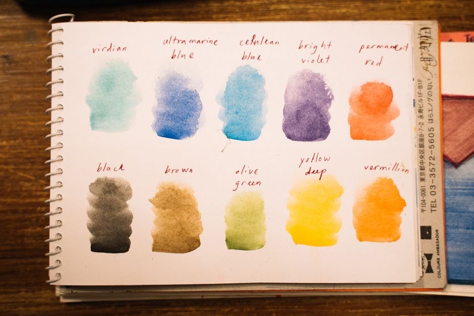
scale_color_manual lets you set point and line colors in ggplot2, assigning specific hues to each factor level for visdistinction.scale_color_manual lets you set point and line colors in ggplot2, assigning specific hues to each factor level for visdistinction.scale_color_manual lets you set point and line colors in ggplot2, assigning specific hues to each factor level for visdistinction.scale_color_manual lets you set point and line colors in ggplot2, assigning specific hues to each factor level for visdistinction.scale_color_manual lets you set point and line colors in ggplot2, assigning specific hues to each factor level for visdistinction.scale_color_manual lets you set point and line colors in ggplot2, assigning specific hues to each factor level for visdistinction.scale_color_manual lets you set point and line colors in ggplot2, assigning specific hues to each factor level for visdistinction.scale_color_manual lets you set point and line colors in ggplot2, assigning specific hues to each factor level for visdistinction.scale_color_manual lets you set point and line colors in ggplot2, assigning specific hues to each factor level for visdistinction.scale_color_manual lets you set point and line colors in ggplot2, assigning specific hues to each factor level for visdistinction.scale_color_manual lets you set point and line colors in ggplot2, assigning specific hues to each factor level for vdistinction.